I used this internship to improve product clarity, onboarding, and
decision-making UX.
Thank you to MetaLearner for the opportunity to contribute. This deck
is a ROI-first walkthrough of what I delivered, why it mattered to the
company, and what it demonstrates about how I think and execute.
9 chart demos4 guide categories3 supported locales1 real-time research repo
What I want you to take away
I improved first-time-user clarity and product discoverability.
I shipped visible frontend work with real UX and technical depth.
I used feedback to sharpen the direction instead of treating it as friction.
I left behind reusable artifacts and references the team can continue from.
Why this matters
The strongest story here is not that I completed a list of tasks.
It is that I increased the product's clarity, learnability, and
reusability while contributing across design, implementation, and handoff.
ReactTypeScriptD3Framer Motioni18nextFigma
ROI First
The story is strongest when ordered by company value, not by chronology.
1Highest ROI
Onboarding and User Guide work that improved first-time-user clarity.
2Visible Delivery
Chart-gallery implementation that improved how MetaLearner explains data.
3Direction
Figma and UX work that gave the team a sharper product and design direction.
4Future Reuse
Technical handoff artifacts and research that reduce future ramp-up cost.
I did not only complete tasks. I improved adoption, decision-support UX,
and the quality of what the team can reuse after my transition.
Onboarding Problem
The highest-value problem was first-time-user clarity.
What a new user could struggle with
Not knowing what MetaLearner actually does yet.
Not knowing where the value lives in the interface.
Not knowing what to click first or how to begin.
Not knowing what to ask the AI assistant.
Not connecting the UI to the product's customer-facing value.
Why this mattered to the company
This was not only a UX problem. If product value stays hidden,
adoption becomes slower, demos become weaker, and new users need
more manual guidance than they should.
Proof from the implemented build: the onboarding flow was tied to
real product surfaces, not left as a concept.
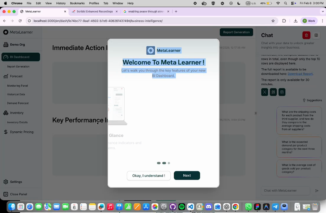
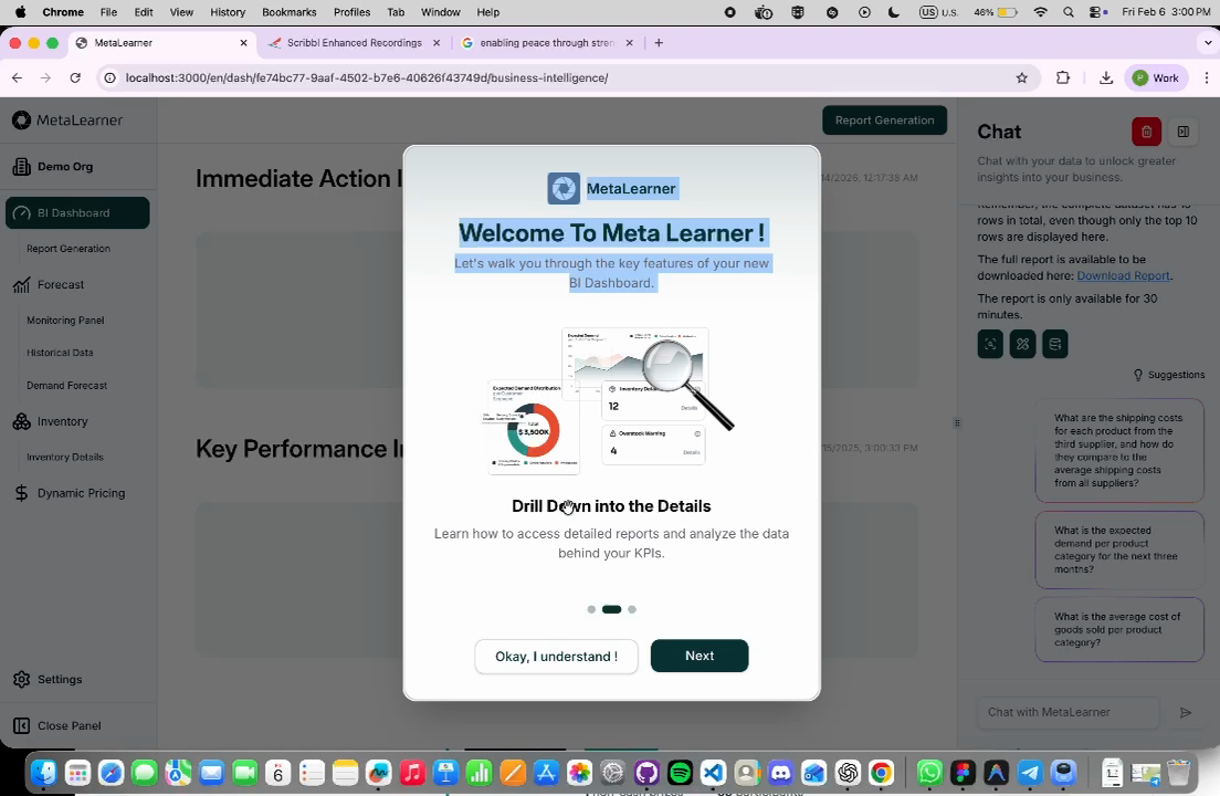
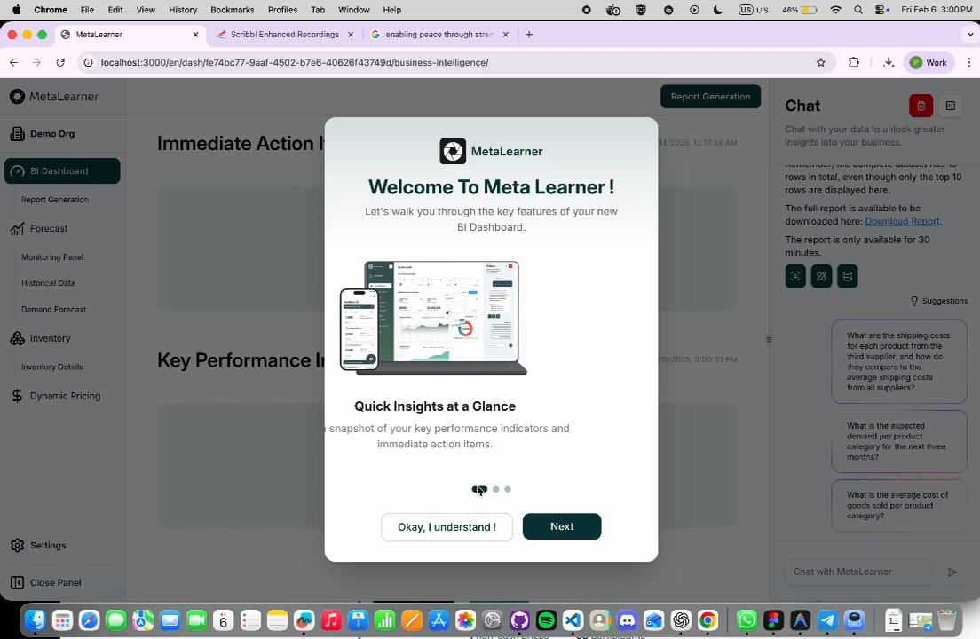
Onboarding Implementation
I implemented a guided onboarding flow instead of leaving discovery to chance.
What was actually built
Onboarding modal with swipe gestures and step navigation.
Feature-level explanations tied to the BI dashboard experience.
"Find out more" links into deeper documentation.
Guided progression that connected UI elements to product value.
Implementation prepared to work alongside MetaLearner's language support.
Guided setupSwipe gesturesStep navigationFind out more
Proof from the demo video
The three extracted frames show the implemented onboarding flow
moving through different guidance states inside the actual product.
User Guide
The onboarding work expanded into a real User Guide system.
What the guide covered
Dashboard Overview for layout, KPIs, and interaction basics.
Drill Down into the Details for chart exploration and deeper analysis.
Ask and Extract Your Data for prompt guidance and AI usage.
Settings for preferences and usage-related guidance.
What made the content useful
Suggested-question guidance for first-time users.
Practical examples of stronger and weaker prompts.
Multi-turn conversation guidance for deeper extraction work.
Content reviewed against the actual product so the guidance stayed accurate.
How it was positioned
This turned onboarding from a one-time modal into a deeper
product-learning layer. Users could start quickly, then continue
learning without needing someone to explain the product live.
The User Guide made the product easier to learn, easier to demo, and
easier to explain consistently.
Strategic Strength
The onboarding work was strong because it solved adoption, not just presentation.
Reduced friction
New users got orientation immediately instead of starting from a blank slate.
Improved discoverability
Important product actions and flows became easier to find and understand.
Less live handholding
Users could learn more independently rather than depending on manual explanation.
Better evaluation
The product became easier to assess during internal review and business-side demos.
"I like the flow, especially the addition of user guide which user could
look at detailed instructions on how to use the product."
Documentation Flywheel
The onboarding docs also create long-term leverage for future documentation.
Step 1
Onboarding introduces the product and lowers first-session confusion.
Step 2
User Guide pages turn one-time onboarding into repeatable self-serve learning.
Step 3
More tutorials, FAQs, examples, and category-specific guides can be added later.
Step 4
Support, demos, and future product growth become easier because the structure already exists.
Why this scales well
Users can self-serve more of the learning process.
Internal teams can explain the product faster and more consistently.
Repeated manual explanation can shrink over time.
Future extension, not delivered work
As documentation volume grows, lightweight search could be added later.
That would support discovery of guides, not redefine the core value already delivered here.
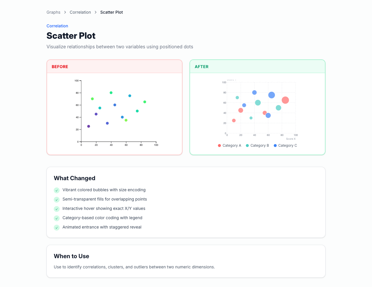
Graph Work
The chart-gallery implementation was the clearest visible frontend delivery track.
What was built
Graph gallery under the public /graphs/* routes.
Reusable chart-detail pages with explanation, sample code, and related navigation.
Before/after comparisons so users could understand what changed.
Chart education that explained when each chart type makes sense.
9Demos
6Categories
3Locales
Live proof capture
Captured from the live local app. The detail-page pattern itself
communicates that the work was designed for reuse and explanation,
not only for a one-off visual demo.
Why Graphs Matter
In MetaLearner, chart quality directly affects whether users understand and trust the data.
Insight-heavy product
MetaLearner depends on data explanation, not only raw numbers.
Readability drives action
Stronger charts help users read trends and act with more confidence.
Exploration matters
Users need to inspect, compare, and question data rather than stare at static output.
Charts are core UI
They are decision-support surfaces, not decoration layered on top of the product.
The graph work matters because it improves one of the product's main
ways of turning data into understanding.
Why Better
The graph implementations were stronger because they improved both usability and explanation.
What improved
Better legends and more intentional color palettes.
Cleaner tooltips with clearer emphasis.
Improved hover behavior and cursor tracking.
Before/after framing that made the improvements easy to learn from.
Better guidance on what each chart type is good for.
Why that is meaningfully better
Users can understand data faster.
Interaction quality supports confidence, not confusion.
The chart pages teach as well as demonstrate.
The structure becomes easier to reuse in future product surfaces.
Carl's early feedback on the bubble chart focused on the quality of
the tooltips and categorical grouping, which was a useful validation
signal that the interaction improvements were noticeable.
Technical Depth
The chart system also demonstrates architecture, not only visual polish.
How the system was structured
Config
Chart definitions are driven by structured config rather than hand-built one-offs.
Routing
Reusable routes make the gallery and detail pages easy to expand.
Rendering
D3 handles chart behavior while Framer Motion adds polished transitions.
Content
i18n-ready content model supports English, Spanish, and Portuguese.
What this signals technically
Reusable chart-detail structure, not isolated demos.
Frontend architecture working together with interaction design.
A system that is easier to expand than a one-time implementation spike.
D3Framer MotionTanStack RouterTypeScripti18next
Potential Impact
The chart work can compound across the product rather than staying isolated to the gallery.
Reusable patterns
More dashboards can inherit the same interaction and explanation patterns.
Consistency
The product gets a clearer visual language for charts and data communication.
Education
End users learn how to interpret chart types instead of only seeing output.
Demos and trust
More polished charts create stronger internal demos and stronger external impressions.
This is why the graph work has value beyond the routes themselves: it
creates a quality bar and a reusable language for presenting data.
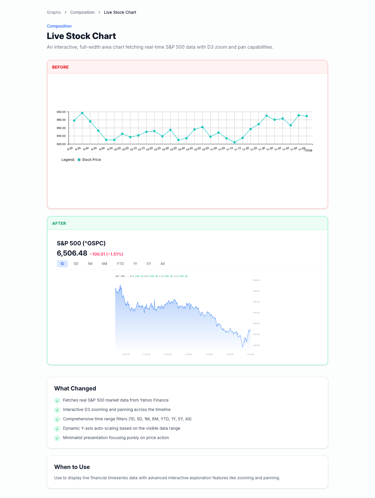
Time-Series Spotlight
The live stock chart is the strongest proof-of-depth example in the gallery.
The stock-chart detail page shows a live time-series example with
redesign explanation and interaction-oriented framing.
Why this matters
Zooming in and out lets users inspect different time horizons.
Hover inspection supports precise reading instead of rough approximation.
Dynamic scaling makes the chart much more useful than a static image.
The same interaction model could be reused for demand, forecast, or other time-series views.
The data fetch through /api/yfinance helps show it is not a fake static mock.
This slide sells both technical confidence and product relevance at the
same time, which is why it should be one of the strongest proof slides
in the hosted version.
Figma And UX
My Figma work became a broader product-direction layer, not just a screen-update exercise.
What I explored
ShadCN-based design direction instead of unstructured UI choices.
Mobile exploration to diagnose where the current experience broke down.
Desktop layouts focused on chat, KPIs, graphs, and clearer information hierarchy.
KPI cards, alert states, overlays, and category-based filtering.
More intentional spacing, typography, and component consistency.
Why this mattered
The team got reusable direction instead of isolated mockups.
The redesign work connected UI decisions to product guidance and clarity.
The Figma file can still be used as a reference point for future product discussions.
Business-side validation influenced the framing of value.
The narrative moved from "better UI" to "help users know what to do."
Chat-led workflow emphasis became stronger.
Why that reflects well on me
This shows I can sharpen work through feedback and make the design
direction more product-grounded over time. The feedback did not
shrink the work. It improved it.
Condensed Timeline
The chronology matters, but it supports the ROI story instead of leading it.
Phase 1
Bubble chart delivery and early interaction improvements built trust quickly.
Phase 2
Mobile exploration revealed deeper design-system and product-clarity gaps.
Phase 3
Figma direction evolved toward desktop-first clarity and chat-led flows.
Phase 4
Onboarding, User Guide, chart gallery, and handoff assets became the durable outputs.
Early chart feedback such as "very nice work Pin Zheng" and "love the
tooltips and the categorical grouping on focus" mattered because they
showed visible delivery before the scope widened.
Research Artifact
I also left behind a future-facing real-time messaging reference repo.
I moved from the initial ask into higher-value product and onboarding opportunities.
I work across layers
I contributed across design direction, frontend implementation, content, and research.
I improve under feedback
I used review input to make the work sharper and more product-grounded.
I leave reusable systems
I packaged routes, guides, demos, and references so the team can keep building.
The strongest case I can make is simple: I improve product clarity, not
only presentation quality.
Closing
Thank you to MetaLearner for the internship.
Thank you for the onboarding, feedback, and trust throughout the
internship. I am happy to walk through the onboarding flow, User Guide,
graph system, Figma direction, or research repo in more detail.
Highest ROI
Onboarding and User Guide work that made MetaLearner easier to understand and evaluate.
Strongest delivery
Graph implementation with reusable routes, interaction depth, and clear explanation.
Durable handoff
Figma direction, artifacts, demo media, and technical references other people can continue from.